Sunday, 29 December 2013

Context that Changed Design - Entry #27


“High Tech ……”


When earlier on I wrote about Pop Design, I mentioned that one of the styles that replaced it was the High Tech.  Actually, the High Tech style appeared for the first time in architecture in the mid-1960s, instilled by the geometric formalism of classical Modernism and the Radical designs of Buckminster Fuller.  However, it was during the 1970s that the designers started to adapt the architects’ High Tech ideas into their interior designs.


The High Tech style opposed the excesses of Pop Design.  The designs were more sensible.  They were created to be useful – for a purpose, rather than for attractiveness.


The pioneers of the High Tech style were British architects, including Norman Foster, Richard Rogers and Michael Hopkins.  They made use of raw industrial elements in buildings.

 Hopkins House.jpg
Sir Micheal Hopkins, Architect (b.1935), (2014), Hopkins House (1976) [ONLINE].
 [Accessed 29 December 13]


galinsky, (2006), Centre Pompidou (Pompidou Center) [ONLINE].
 [Accessed 29 December 13]


The industries’ utilitarian equipment and fittings, which were usually produced for factories and institutions were being used in High Tech interiors – for example trolleys, rubber flooring, clip-on lighting, galvanized zinc shelving and scaffolding poles.  The High Tech interiors often included primary colour schemes –  a characteristic of De Stijl.


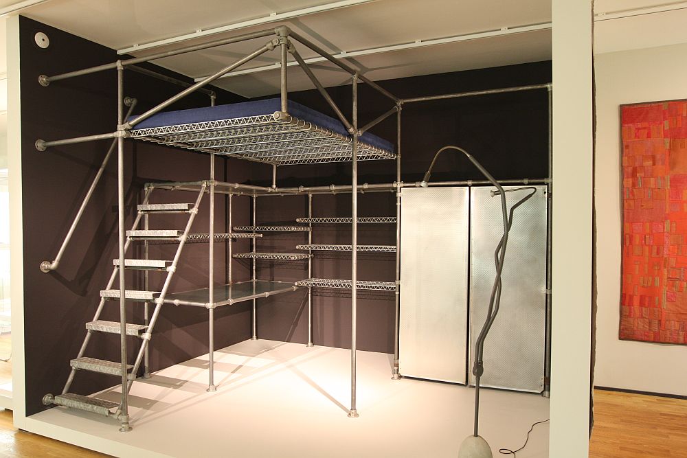
In America, promoters of the High Tech style included Joseph Paul D’Urso and Ward Bennett.  They worked with salvaged industrial materials.  In 1978 Joan Kron and Susan Slesin published a book about the High Tech.  Its title was “High Tech – the industrial style and source book for the home”.  However, by that time the style was already declining and in fact, in the early 1980s it was replaced by Post-Modernism.  Still, in the mid-1980s, some British designers, including Ron Arad and Tom Dixon, were inspired by the High Tech ideas of using industrial elements, and they created “one-off” designs from salvaged materials – these included scaffolding poles, car seats and manhole covers.


 Grassi Museum for Applied Arts Leipzig Art Nouveau to Present Ron Arad
(smow), (2013), A 1980s bedroom/study ensemble by Ron Arad. As see at the Grassi Museum for Applied Arts Leipzig [ONLINE]. Available at: http://www.smow.com/blog/wp-content/uploads/2012/03/Grassi-Museum-for-Applied-Arts-Leipzig-Art-Nouveau-to-Present-Ron-Arad.jpg
[Accessed 29 December 13]

7. Ron Arad Rover Chair
Despoke , (2010), Ron Arad rover chair [ONLINE].
 [Accessed 29 December 13]


Other Reference:  


Book: Fiell, C.F and P.F, (1999). Design of the 20th Century. 2nd ed. Germany: Taschen


Friday, 27 December 2013

Context that Changed Design - Entry #26


“Radical Design ……”


Radical Design was similar to Anti-Design but more theoretical, experimental and engaged in politics.  It was developed in Italy in the late 1960s.  When I wrote about the Anti-Design, I mentioned that the Movement influenced a group of avant-garde Italian designers – they opposed Good Design and “good taste”, and they wanted to change the general idea of Modernism.  The Italian design and architectural groups included:


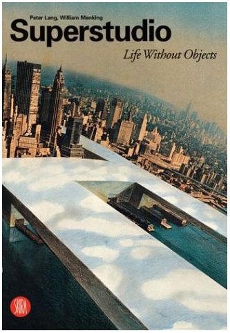
  • Superstudio
reveal in new york, (2009), Italians Do It Better: The Radical Design of Superstudio [ONLINE].
 [Accessed 27 December 13]

  • Archizoom
Affiche de l'exposition
EPA, (2007), ARCHIZOOM ASSOCIATI 1966-1974 [ONLINE].
[Accessed 27 December 13]

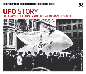
  • UFO
UFO STORY Dall'architettura radicale al design globale | Centro per l'arte contemporanea Luigi Pecci | Viale della Repubblica, 277 - Prato, 29 sep. 2012 - 3 feb. 2013
m-a-g-a-z-i-n-e.net, (2013), Centro per l'arte contemporanea Luigi Pecci [ONLINE].
[Accessed 27 December 13]

  • Gruppo Strum
Disegno.daily, (2014), The fotoromanzo The Struggle for Housing by Gruppo Strum caused an outrage at the exhibition [ONLINE].
wg6BnA6CnRodW1iSSIKNTQ5eD4GOwZUWwg6BmU6CGpwZ0kiEC1xdWFsaXR5IDgwBjsGVA/Gruppo%20Strum%20magazine.jpg
 [Accessed 27 December 13]

  • Gruppo 9999
9999-16d
9999 group , (2011), Gruppo 9999, Image for New Domestic Landscape exhibition display, 1972. [ONLINE].
 [Accessed 27 December 13]

  • Cavart
domus, (2011), Cavart (Pier Paola Bortolami, Piero Brombin, Michele De Lucchi, Boris Pastrovicchio, Valerio Tridenti), seminar on “Culturally Impossible Architecture”, Montericco Quarry, Monselice, 1975 [ONLINE]. Available at: https://www.domusweb.it/content/dam/domusweb/en/architecture/2011/03/22/radical-visions/big_332973_7172_DOM110318017_UPD1.jpg
[Accessed 27 December 13]

  • Libidarch
Libidarch Architetti Associati, (2009), Libidarch Architetti Associati [ONLINE].
 [Accessed 27 December 13]


The above groups attacked the ideas of what made up “good taste”, and their designs tried to destroy the dominance of Modernism.  They presented installations that raised doubts about the validity of rationalism, advanced technology and consumerism.


“Il Monumento Continuo” (meaning “Continuous Monument”) of Superstudio and the “Wind City” of Archizoom that were presented in 1969, were amongst the radical architectural projections that exposed the idea of architecture as a political instrument .

 
Superstudio, (2013), Il Monumento Continuo, New New York - Superstudio (1969-1971) [ONLINE].
 [Accessed 27 December 13]
 
Wind City, architectural project by Archizoom (1969).
At Home, At Work, At Play , (2013), Wind City, architectural project by Archizoom (1969). [ONLINE].
 [Accessed 27 December 13]


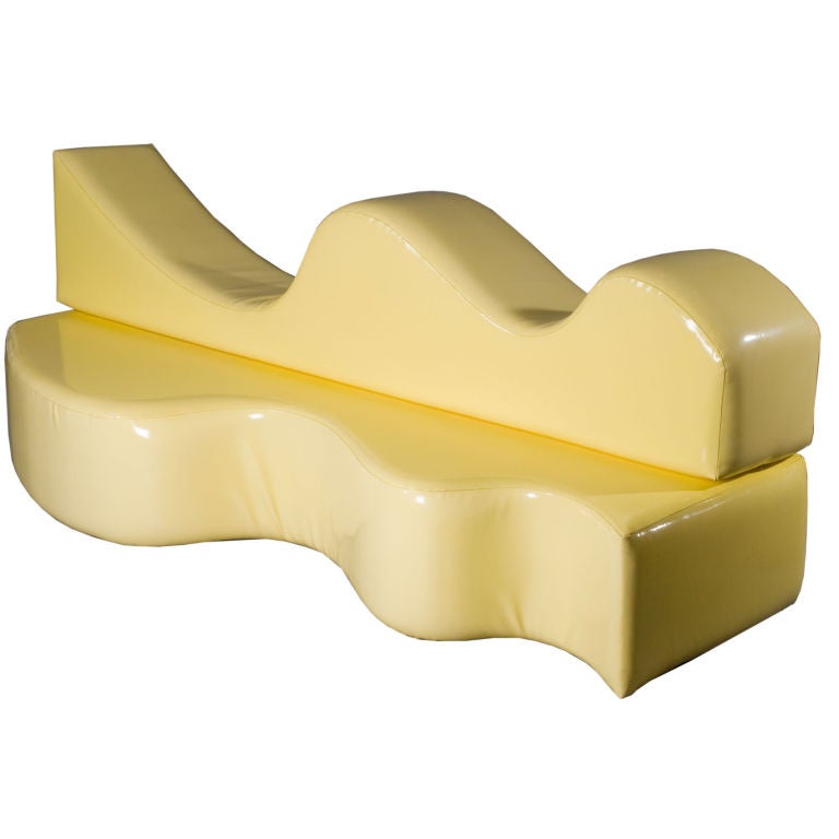
Certain radical designs, for example the “Doric Temple” (1972) of UFO and “Superonda” (1966) of Archizoom were often characterized by their ability to interact with the user.


liveauctioneers, (2014), 218: UFO GROUP RARE DORIC TEMPLE INSTALLATION, CA. 1 [ONLINE].

 [Accessed 27 December 13]


 1stdibs, (2013), Original Archizoom Superonda sofa [ONLINE].
[Accessed 27 December 13]


In 1973, members from several Radical Design groups gathered at the offices of “Casabella” magazine where Alessandro Mendini was director.  This meeting led to the foundation of the radical architecture/design school named “Global Tools” in 1974 – the school that I already mentioned when I wrote about Anti-Design.  However, as I said earlier on, “Global Tools” ceased to function a year later and although those involved quickly lost their impetus, Radical Designers who used to question the long-established principles of the aim of design, especially Andrea Branzi, Riccardo Dalisi and Lapo Binazzi, laid the conceptual foundations from which Post-Modernism developed in the late 1970s and early 1980s.


Other Reference: 


Book: Fiell, C.F and P.F, (1999). Design of the 20th Century. 2nd ed. Germany: Taschen


Sunday, 22 December 2013

Context that Changed Design - Entry #25


“Anti-Design ……”


Anti-Design rejected the rational guidelines of the Modern Movement and sought to make an individual’s visionary communication within design acceptable.


Surrealism was one of the first examples of Anti-Design and in the 1940s it influenced the Turinese Baroque Style – a style of Italian designers, including Carlo Mollino, who were against rationalism.


Anti-Design influenced the progressive artists, commonly known as the avant-garde, in the late 1960s.  At that time, several design groups that were forming in Italy no longer believed in Modernism.  They protested against Modernism.  According to them, Modernism was no longer a cultural compelling influence because it had been damaged by industrial interests, when industrialists turned it into a consumerist marketing venture.


The Anti-Design Movement highly criticized the advanced technology and consumerism.  In 1974 a school called “Global Tools” was founded, in order to discover simple non-industrial techniques to encourage individual creativity.  However, “Global Tools” lasted only a year and that marked the end of the first period of the Anti-Design of the 1970s.  At that point, certain designers who were associated with the Anti-Design Movement, including Alessandro Mendini and Ugo La Pietra, thought that there was no future for the design that they believed in.  However, within three years, those designers who were involved with Studio Alchimia took up the Anti-Design Movement once again.  They wanted to bring back design that was spontaneous, creative and with a meaning. Studio Alchimia was an Italian design studio (not in favour of Modernism) founded in 1976, initially as a gallery to exhibit works which were not created under any industrial production pressure.


At the beginning of the 1980s, Charles Jencks, amongst other American critics of Modernism, called for “elements which are hybrid rather than pure …… messy vitality over obvious unity”.  Jencks was very much against Modernism and he referred to the rectilinear high-rise buildings constructed in the 1960s as “dumb boxes”!  Those buildings were inspired by the architecture of Le Corbusier and Ludwig Mies van der Rohe whom I mentioned when I wrote about the International Style and Bauhaus.


In the 1980s, when the American critics of Modernism emerged, along with Memphis (founded in Milan, Italy in 1981), Anti-Design, with its liberation from formality and simplicity evolved into a well-known international style – Post-Modernism.

design IQ, (2013), Zanotta SACCO bean bags [ONLINE].
 [Accessed 22 December 13]

 
gift guid, (2013), Guido Drocco and Franco Mello Cactus Coat Stand [ONLINE].
 [Accessed 22 December 13]


Alessandro Mendini, Kandissi, 1978, legno e stoffa
milano arte expo , (2012), Alessandro Mendini, Kandissi, 1978, legno e stoffa [ONLINE].
[Accessed 22 December 13]


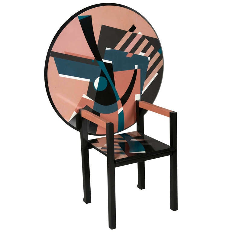
Mendini "Zabro" chair-table
 1stdibs, (2012), Mendini "Zabro" chair-table [ONLINE].
 [Accessed 22 December 13]


Other Reference: 


Book: Fiell, C.F and P.F, (1999). Design of the 20th Century. 2nd ed. Germany: Taschen


Tuesday, 17 December 2013

Context that Changed Design - Entry #24


“What inspired Pop Designers ……”


Pop designers were motivated by the growth of the universal mass-media and they were inspired by various sources, including the Art Nouveau, Art Deco and Futurism that I have already written about.


Other sources that inspired Pop Designers were:


  • Surrealism
  • Op Art                            
  • Psychedelia            
  • Eastern Mysticism 
  • Kitsch
  • Space-Age


Surrealism was an artistic movement inspired by studies regarding the subconscious and dreams that were carried out by Sigmund Freud.  This expressed the development of thought.  During the 1930s it started to look like a political movement because many of its members got involved with the Communist party.  Its anti-realistic attitudes opposed the existing beliefs of art and design.


Op Art stands for Optical Art which is a way of painting.  Op Art works are abstract and usually in black and white, and they give the viewers mixed impressions, including movement and hidden images, flashing and oscillations.


Psychedelia refers to the subculture of people who use psychedelic drugs before they produce artwork or music so that they show the viewers or listeners their experiences while they are under the effect of drugs.


Eastern Mysticism refers to the Eastern range of religious traditions and practices.


Kitsch is the very opposite of Good Design (that was practiced by the Modern Movement).  It describes products that are cheap and that show poor taste.


Space-Age – In 1961, US President John F. Kennedy said that America could land a man in the moon (an event that was realized in 1969).
movieclips. (2011). 2001: A Space Odyssey Official Trailer #1 - (1968) HD . [Online Video]. 16 June. Available from: https://www.youtube.com/watch?v=Ok32VyEQYYc.
 [Accessed: 17 December 2013]

So that era, when the exploration of space became possible, inspired designers, such as Vogue’s André Courreges, was called for space age clothes.  Lunar white and silver (the colour of space suits) became colours of fashion. 


 Space-Age-Fashion-hero.jpg
Voguepedia, (1964), Turning Points Space Age [ONLINE].
[Accessed 17 December 13]


Other examples of Pop designs inspired by Space-Age are the following:


  • Edward Mann – Felt Helmets (Dots & Moon Designs)
Celia Hammond and Pattie Boyd wearing two Capsule line felt helmets with dots and moons, photo John French. London, England, 1965
V&A, (2014), Celia Hammond and Pattie Boyd wearing two Capsule line felt helmets with dots and moons, photo John French (1907-66), designed by Edward Mann, and modelled by Patti Boyd & Celia Hammond. Photograph. London, England, 1965. [ONLINE].
 [Accessed 17 December 13]


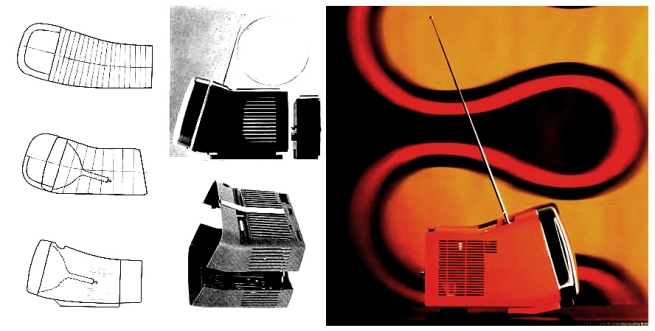
  • Richard Sapper & Marc Zanuso – Algol TV
brionvega-algol-tv-lg7
Brionvega, (2009), Algol TV [ONLINE].
[Accessed 17 December 13]


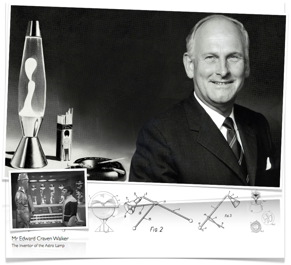
  • Edward Craven Walker – Original Lava Lamp 1963

mrwalker
www.flowoflava.com, (1963), Edward Craven Walker & Crestworth Ltd Patents [ONLINE].
Available at: http://www.imovatedesign.co.uk/astro/mrwalkermain.jpg
 [Accessed 17 December 13]


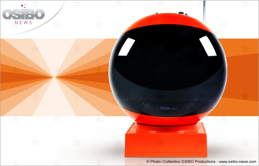
  • Nivico 3240 GM TV for JVC
Pierre-Alek BEDDIAR, (2012), La vue de 3/4 permet de bien voir le socle sur lequel repose le téléviseur. [ONLINE].
 [Accessed 17 December 13]


Other References:
 
Book: Fiell, C.F and P.F, (1999). Design of the 20th Century. 2nd ed. Germany: Taschen
 
Book: Various contributors, (1999). The Art book. 2nd ed. London, England: Phaidon


Voguepedia. 1964. Turning Points Space Age. [ONLINE] Available at: http://www.vogue.com/voguepedia/Space_Age.
 [Accessed 17 December 13]


Sunday, 15 December 2013

Context that Changed Design - Entry #23


“Pop Design ……”


Pop refers to the popular culture that emerged in the 1950s.


The members of the “Independent Group” which was founded in London in 1952 were very interested (and also praised) the growth of the popular consumer culture in America.  These members included the artist Richard Hamilton, the sculptor Eduardo Paolozzi, the design critic Reyner Banham and the architects Peter and Alison Smithson.  Even American artists, such as Andy Warhol, Roy Lichtenstein and Claes Oldenburg were being inspired by the “low art” aspects of life that were in fashion in the 1960s, for example advertising, packaging, comics and television.  The Good Design approach of the Modern Movement was diminishing because the designers developed a less serious approach to design.  Industrial production in the 1960s did not consider the Modern Movement’s saying “Less is More” as important anymore.  The attitude changed to:
“use-it-today, sling-it-tomorrow”
 Perfect examples of design that came out at that time were the following disposable objects:


  • The polka-dotted cardboard “Spotty” child’s chair of Peter Murdoch in 1963, and
  • The PVC “Blow” chair of De Pas, D’Urbino and Lomazzi in 1967.
 [Accessed 15 December 13]


Jonathan de Pas, Donato D Urbino and Paolo Lomazzi Blow Armchair
bonluxat, (2013), Jonathan de Pas, Donato D Urbino and Paolo Lomazzi Blow Armchair [ONLINE]. Available at: http://static1.bonluxat.com/cmsense/data/uploads/orig/Jonathan_de_Pas%2C_Donato_D_Urbino_and_Paolo_Lomazzi_Blow_Armchair_6nq.jpg
 [Accessed 15 December 13]

Jonathan de Pas, Donato D Urbino and Paolo Lomazzi Blow Armchair
bonluxat, (2013), Jonathan de Pas, Donato D Urbino and Paolo Lomazzi Blow Armchair [ONLINE]. Available at: http://static1.bonluxat.com/cmsense/data/uploads/orig/Jonathan_de_Pas%2C_Donato_D_Urbino_and_Paolo_Lomazzi_Blow_Armchair_2vc.jpg
[Accessed 15 December 13]


Even glossy magazines and colour supplements that were issued at that time were featuring cheap items that were not long-lasting, for example paper dresses. 


So, as one can imagine, the main materials that pop designers were using were “plastics”.  In fact, by the 1960s many new inexpensive types of plastics and techniques (including injection moulding) became available. 


The simplicity that prevailed after the Second World War came to an end.  In fact, Pop Design was associated with gleaming rainbow colours and distinct forms.  At the same time, this brought about general optimism which was re-inforced by economic growth and sexual freedom.


Pop Design was directed towards the youth market and so, since the products had to be cheap, they couldn’t be much of good quality.  Gone were the days of producing “timeless” modern classics!


Other Reference:


Book: Fiell, C.F and P.F, 1999. Design of the 20th Century. 2nd ed. Germany: Taschen


Tuesday, 10 December 2013

Context that Changed Design - Entry #22


“Streamlined logos……”


Rods 'n' Sods, (2013), Logo designs [ONLINE].
Available at: http://imagehosting.rodsnsods.co.uk/22894c06699d9af05.jpg
[Accessed 10 December 13]


Shell - Raymond Loewy
pinterest, (2013), Shell - Raymond Loewy [ONLINE].
 Available at: http://media-cache-ak0.pinimg.com/736x/39/3d/73/393d739f74d6be5fe54d9ef76d7d7259.jpg
 [Accessed 10 December 13]


Loewy Coca-Cola Designs


OTIS Learning portfolio, (2013), Loewy Coca-Cola Designs [ONLINE].
 Available at: https://ospace.otis.edu/files/Ma7eaa6d2e47fc810374a7ebec3cf43c1.JPG
[Accessed 10 December 13]


Lucky Strike cigarettes

OTIS Learning portfolio, (2013), Lucky Strike cigarettes [ONLINE].
Available at: https://ospace.otis.edu/files/Ma4eb48410aa8ac042167135867decdd7.jpg
[Accessed 10 December 13]


A few automotive logos:


step brightly a creative group, (2013), NFL: Streamline your graphic design to look FAST [ONLINE].
 Available at: http://hellodesigners.files.wordpress.com/2009/03/jaguar-logo-copy.jpg?w=283
[Accessed 10 December 13]


Google and its 'streamline' experience - the change that took place in its logo:
Ishbel Macleod, (2013), before and after logos from Ars Technica [ONLINE].


Gismodo, (2012), What Do You Think Of eBay's New Logo? [ONLINE].
 Available at: http://img.gawkerassets.com/img/17z064f1lqgdajpg/xlarge.jpg
 [Accessed 10 December 13]


The logo of Kentucky Fried Chicken that was modernized after 1990
- revealing simplified and streamlined text and artwork:
Kentucky Fried Chicken logo updates
ImageSmith , (2012), The New Wendy’s Logo: Contemporary Brand Design [ONLINE].
[Accessed 10 December 13]


Credit and Debit cards:
Cards we Accept

Vida Homes, (2013), Payment [ONLINE].
 [Accessed 10 December 13]


The change that took place recently in the Windows logo,
making it simple and streamlined:


image007
Joseph Maalouf , (2013), Windows 8 logo design: TAGbrands designers have their say [ONLINE].
 [Accessed 10 December 13]